MoneySuperMarket
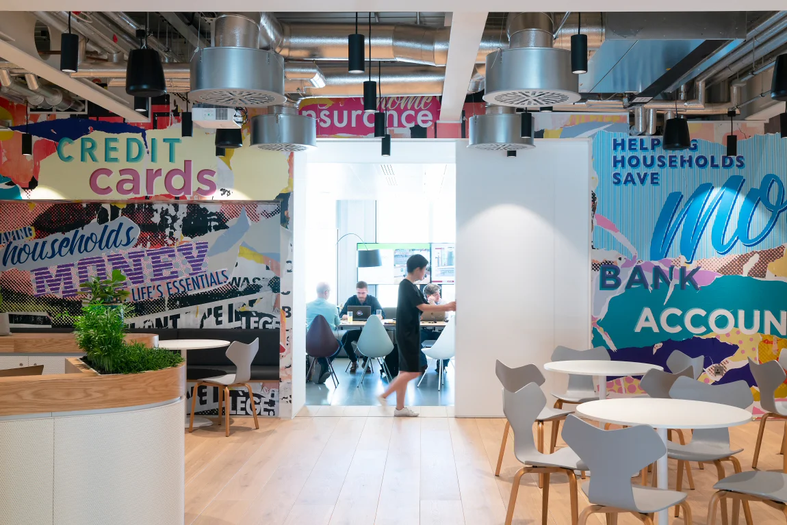
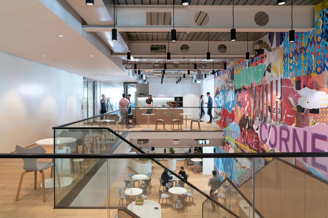
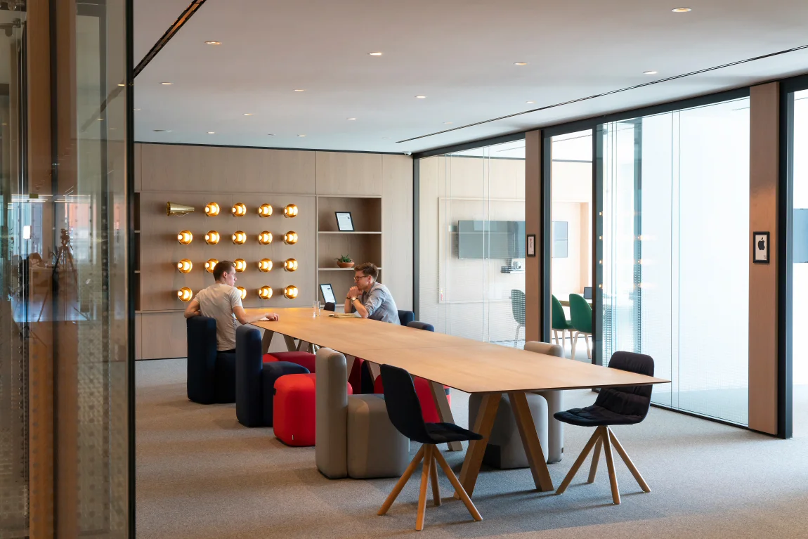
Simple, honest, down to earth and upbeat as possible for their customers – this became the driving force behind the look of the space and choice of materials. Balance is an extremely appropriate word to use here. There is a fantastic balance between focused workspaces, formal meeting areas and informal, collaborative areas. All flow seamlessly, subtly demarked by changes in material use, lighting levels and brand integration.
The Facts - Client: MoneySupermarket | Size: 2,000sqm | Location: London | Status: Completed | Year: 2018
Key Features - Triple height staircase and brand wall.
Opinion - Published, Mix Magazine, May 2018 | Shortlisted for British Council for Offices Fit Out of Workplace Award 2019 | Published, FX Magazine, June 2019


